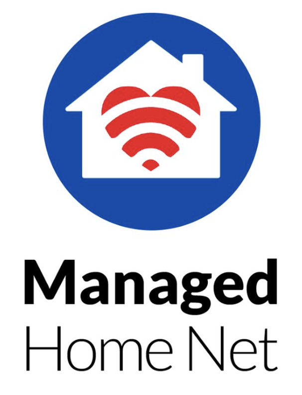
What do you think of our new logo?

Designing a new logo for a new service is scary and hard. I wanted to create a logo that captured everything important about our new service, Managed Home Net.
- Wi-Fi – The symbol is important – You can tell immediately that this is a service or company that is about the wi-fi network.
- Home – The Home is where we focus. Homes are chaotic, uncontrolled messy networks. People and devices come and go and the home network may be slowed down or vulnerable to attacks.
- Heart – This is more than a technology solution. This is about our commitment to care for our clients and have compassion for their needs. Our support is not technical support, it is about helping humans cope with the technology frustrations they deal with on a daily basis.
I wanted the brand to stand alone. As we rolled out this service, we realized that people all over needed and wanted it. We work on any ISP and we wanted the name to not be “Ashland” centric.
It will be interesting to see how this brand evolves. I’m not sure about the eves or the chimney.
And I said early that it’s scary. We live in a social hyper world now where every opinion is an expert opinion. Some of you will be nice and not say anything or let me know you like it, but some will tell me that I am an amateur and should have sired a professional.
I’m an entrepreneur. I designed this logo and I’m proud of it.
Let me know what you think. Drop me a note at Jim@ProjectA.com
Jim Teece
